

Stationery
01

LE PHAN
After receiving the design brief for the whole brand identity for Le Phan, a company that distributes kids’ products, J Studio immediately came up with the idea of a playful, colorful, and lovable logo. The letter L and P are symbolized by a tree seed covered with easy on the eyes color of orange and green. The stationeries of Le Phan's brand identity system are also meticulously cared for.
02
GTC
GTC is a travel company that has been operating for over 10 years in the Vietnamese market. GTC’s request for J Studio is to create a new stationery identity with the logo provided.
J Studio has changed completely the image of GTC when using circles in the logo to create a sense of closeness, easy-to-recognize and youthful in their stationery.

03

KAO TOURS
Same operating field as GTC, but KAO Tours is a completely new brand in the market.
J Studio has tweaked the colors of the logo and finished the brand stationery for KAO Tours with the aim of a luxurious but youthful and enthusiastic vibe. This is one of the projects J Studio has done the quickest, in just 3 working days, and also a project that the client highly regarded and extremely satisfied with.
04
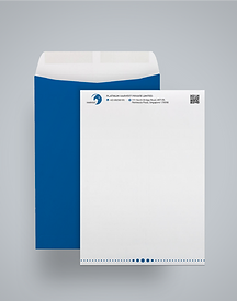
PLATINUM HARVEST
Platinum Harvest is a Singaporean company, trading mainly in coal and petroleum. The client took the initiative in designing the logo and J Studio's work was simply refining and creating other stationery in Platinum Harvest's brand identity.


05

DGVN
DGVN is one of J Studio’s most unique clients, specializing in researching, developing, and implementing unmanned vehicles. This is truly a challenge, but also a great opportunity for the creative team of J Studio to come up with stationery that is simple yet “chock-full” of technical characteristics.
06
GTEL MOBILE
As a state-owned telecommunications company, GTEL Mobile is one of J Studio’s most “fastidious” clients. The logo of GTEL Mobile combines all the luxurious elements with personality, is modern, and holds the identity related to the police field.
